Showing posts with label colors. Show all posts

Nov 9, 2015

Phtalo Emerald vs Veridian - what's the difference?

I recently attended a workshop and found Veridian on the supply list.  My first teacher insisted that I use Veridian; since then it's always been Phtalo.  I (brilliantly) left my paint box home when going to this last workshop, so I spent an hour and some bucks at the local art shop.  When I came to the Veridian, I was surprised to find that it is considerably more expensive.  And NO ONE I asked could tell me the difference other than that "they are different chemical compositions."  I have lots of Phtalo at home, so I picked up a small tube of Veridian.

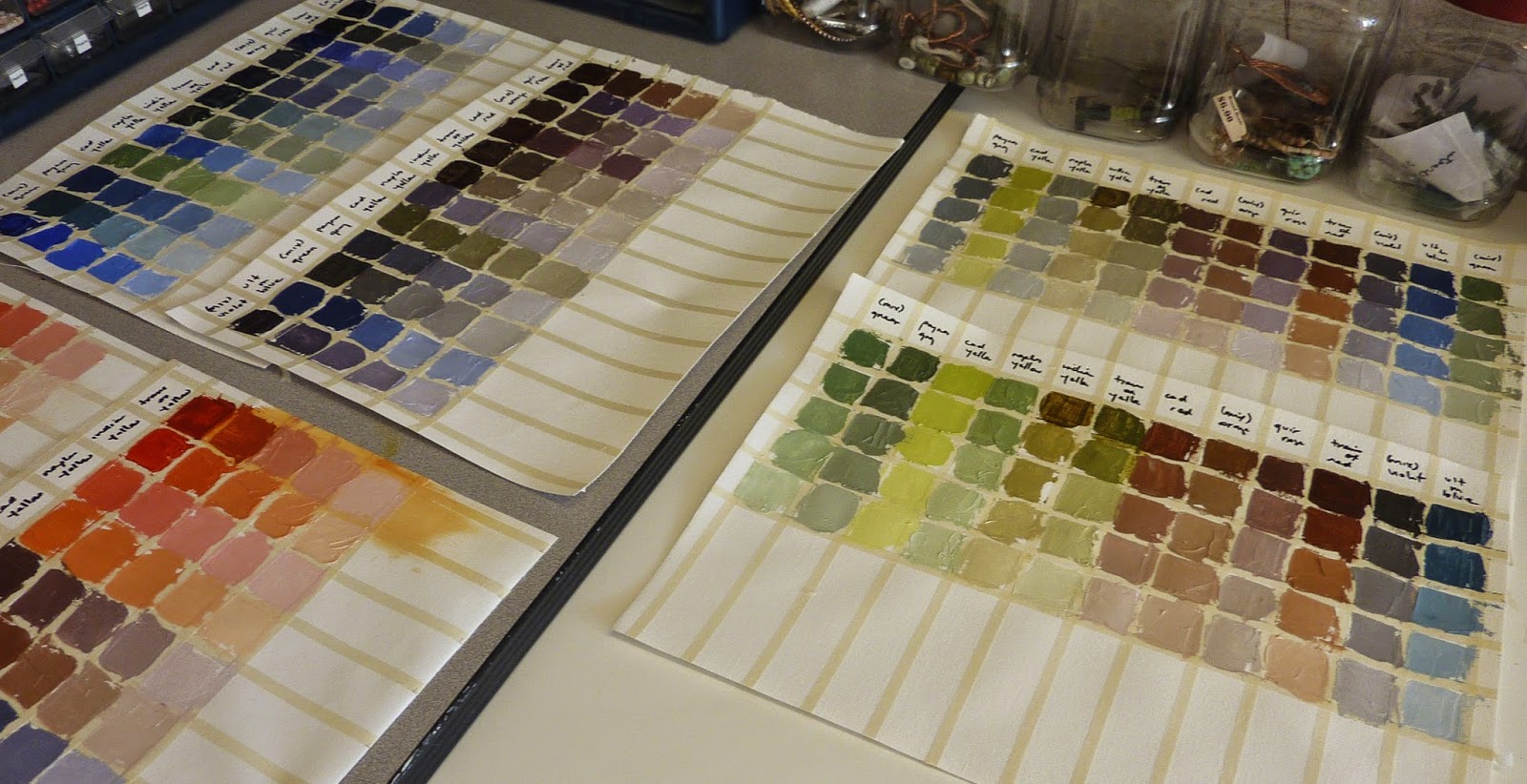
A week later, I still haven't found anyone who could give me a good description of what each does and how they differ.  So this afternoon I decided to make a Richard Schmidt color chart and see if I could find out on my own.

I mixed each with white, cad yellow lemon, trans-ox yellow & white, alizarin & white, cobalt & white and ultramarine blue & white.  My conclusion:  Veridian may be a tad cooler.  It requires a bit more paint to tint the same amount of color.  After that - duh.  They seem pretty much interchangeable to me.  According the Gamblin Colors, they are both lightfastness I.  If you don't see much difference in the colors on the chart, that is because there isn't one!

So, I'll use Phtalo judiciously at half the cost of Veridian!  If any of you have other observations, I'd appreciate hearing!


Sep 16, 2014

Dog’s in the dinghy! Day 16

I’m taking a workshop in Pasadena CA with Leslie Saeta – playing with palette knives.  We are CERTAINLY painting – all day long.  This is what I did today – and obviously my dog is hiding in the bottom of the middle dinghy!


http://www.dailypaintworks.com/fineart/daryl-lyn/reflections/257984


Aug 11, 2014

Linda Fisler #4 Mood large

                       
 This online workshop with Artists Network University was wonderful!  Each exercise proved to be challenging – and I’ve learned so much – Linda Fisler is an excellent coach!


When going from my 30 minute study to the larger piece, I pre-mixed most of the colors first.  Even then, once they got onto the canvas, it began to change – the cool violets began to look green when compared to the warmer ones and the yellows.  Really odd.  So I greyed lots more, and put in some detail that didn’t go in the study.  Photos are: current stage of painting (I’m waiting for Linda’s recommendations to finish it) and the study (as a reminder).


Aug 9, 2014

Linda Fisler #3 and #4 take 2

Linda Fisler #3 & #4  take 2

I made some changes to the floral based on Linda’s coaching.  Think it’s much nicer now.  Also, gave myself 5 minutes each this morning to add some complementary color to the three mood studies that were flat.  Linda was “spot on” again!  Now I’m on the finish the assignment: going to do the large version in the purples.


Aug 5, 2014

Linda Fisler #4 - mood

Been traveling and workshopping (more on that later), so it took me a while to get back to the Linda Fisler online workshop.  The assignment was to write 4 moods on scraps of paper (Sorrow, Joy, Peace, Anger), choose a photo to paint and then randomly pull a mood out of the hat.  Then, paint in that mood.  I cheated and decided to do each mood in a color study (30 min study each) and then will choose which to do in large.  I've sent them on the Linda - will have to choose one by tomorrow morning so I can get started on the big painting.  Any preferences???

They are in order: original photo, anger, joy, peace and sorrow.


Jul 5, 2014

Linda Fisler lesson #2


Great feedback on the black & white painting from Linda Fisler. Helped me focus on the depth of the piece, and how to make each layer of stone recede.  This 2nd challenge is to look at the photo and determine what kind of composition it is, using Edgar Payne’s book.  Also to look and see if it needs to be cropped or changed to improve the composition.  Since I had already changed the composition from the original photo by reducing the left side and moving the door off-center, I didn’t have more compositional changes.  Looks to me like either an “O” composition or a “Tunnel,” which Mr Payne indicates are often interchangeable.  I really focused on the colors and values for depth in the painting.  Did I get it?


Jul 3, 2014

K Hu lesson #4 - Finished portrait

Here's what I turned in.  I like the colors on her skin much more than before, and I think I'm close.  But it still isn't quite there.  I'm thinking a bit more definition on her neck and highlights on the skin.  Any suggestions?


Jun 17, 2014

Color charts


First thing I did after Kathleen's workshop was to work on some color charts.  I love the idea of a limited palette, but I also love the process I used with Qiang Huang  and Nancy Medina – starting with transparent paints for the foundation and shadows.  And I didn’t get satisfactory purples from the perm red and ultramarine blue.  So, I was looking for a couple of additions.  I was also finally going to look at several different brands of the same paint color; and do a study of the alizarin and other blue-reds colors to see which were closest to alizarin.   Now that I’ve chosen to add Indian Yellow, Transox Red and Alizarin, it’ll be interesting to see if I use them!